Designing company logo
Discover key tips for designing company logo effectively. Learn principles, color psychology, and strategies to create a memorable, versatile brand identity.
8 minutes read


Discover key tips for designing company logo effectively. Learn principles, color psychology, and strategies to create a memorable, versatile brand identity.
8 minutes read

Author:
Admin
Updated:
August 20, 2025
When launching a new business, your to-do list can feel endless. But among all the tasks wanting your attention, choosing the right logo should be top on your priority list.
A logo is not just a beautiful graphic-it’s a key part of how your business is recognized and remembered. Without a clear, specific image, it becomes difficult for people to differentiate your business from the rest.
A carefully designed logo does more than specify your company-it helps in telling your story. It reflects the personality of your brand and gives customers a glimpse of what makes your business special.
While it’s helpful to be aware of current logo design trends, trends come and go. What really matters is following proven design principles and understanding the science behind what makes a logo effective. With the right approach, your logo can become a powerful tool for building recognition, trust, and connection with your audience.
Your brand strategy should effectively convey the essence and identity of your business.
A logo’s primary purpose is to visually represent your unique brand. Therefore, relying on free logo generators or commissioning low-cost, generic designs from inexperienced sources often results in uninspired, stock visuals that fail to capture your brand’s distinct personality and may ultimately undermine your business—values, purpose, and character.
This can be achieved through thoughtful use of color, shape, typography, and composition. However, these are merely foundational elements. A skilled designer will integrate them with creativity, psychological insight, and a deep understanding of your brand to craft a logo that is not only visually appealing but unmistakably yours.
In a fast-paced, distracted world, your brand must be immediately recognizable. Your business name and logo work together to ensure customers instantly identify your brand across all platforms—whether it’s your website, storefront, or app.
To achieve this, a distinctive shape is essential. Challenge your designer to move beyond generic layouts like “text in a box” or “initials in an oval.” A unique color palette can enhance recognition, but shape should remain the primary focus—color supports, but does not lead.
Your logo should work seamlessly across all mediums—from websites and business cards to social media and marketing materials. It must remain clear and identifiable in various sizes, formats, and color schemes, including monochrome.
Simple test: If your logo appears in one color on a busy background, is it still instantly recognizable? If not, it needs refinement.
Great logos stand the test of time. Iconic brands like Nike or Coca-Cola have used the same logo for a long time, building recognition through consistency. Avoid trendy designs that may quickly become outdated. Instead, focus on a logo that will evolve with your business and support long-term brand growth.
Best practices are valuable when creating a logo, but they’re not your only guide. We’ve already explored how science can boost your marketing efforts, and the same principles can help you make smarter, more confident choices when designing your company’s logo.
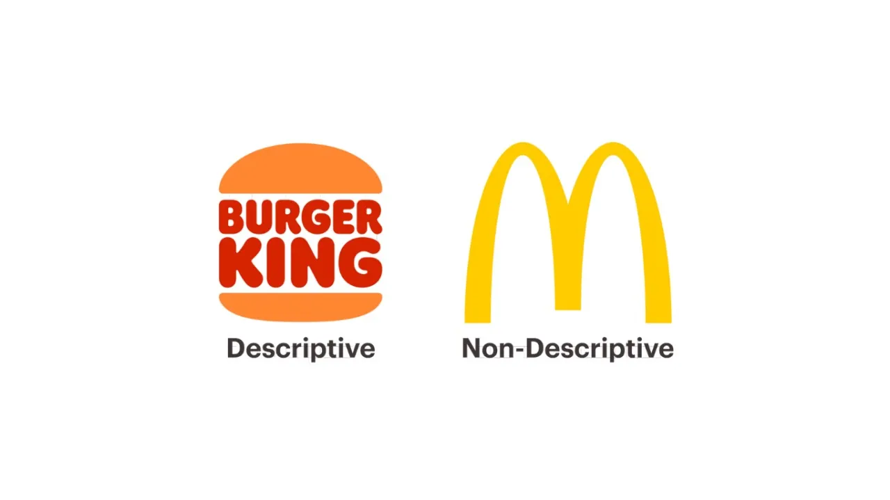
This image compares descriptive and non-descriptive logos.
Descriptive (Burger King): Shows or hints at what the brand offers—in this case, a burger—making it instantly clear but less flexible for future brand expansion.
Non-Descriptive (McDonald’s): Uses an abstract symbol—the golden arches—with no direct product reference, offering versatility but requiring more marketing to build recognition.

This image highlights how shape choice impacts brand feel. Circular and organic forms—like the eggs and leaf—often convey friendliness, softness, and approachability. Angular and geometric shapes—like the cubes—suggest precision, stability, and structure. In logo design, blending these shapes can balance warmth with professionalism.
Colors can change how we feel and even how we think. In logo design, the colors you choose send a message before people even read your brand name.
No comments yet. Be the first to post!